If some of the styles above look familiar, they should. Many of them were derived from other articles on the CodeProject website. The Style Toolkit doesn’t use code from other articles, only definitions of things like colors, effects, border sizes, etc.
The Style Toolkit does not predefine styles, in the same sense that C++ does not predefine classes; therefore, the number of styles that it can create is infinite. Of course, once you have created a style, similar to creating a class, you can reuse it, modify it, and share it.
All the style components are created with layers, as if you were using a program like Photoshop; however, unlike Photoshop, all the layers are created programmatically. It doesn’t matter if it is a background, an indicator control, or an aqua button; they are all created by defining a sequence of graphics operations.
Background
The Style Toolkit uses GDI+; however, aside from the required initialization and the fact that it needs to compile and link correctly, it is transparent to the user. This article will not cover how to use and incorporate GDI+; if you are unfamiliar with it, read my GdipButton[^] article and other resources here on The Code Project.
Usage Preview
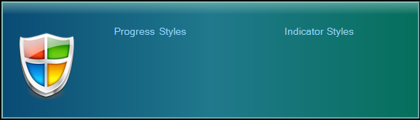
To demonstrate the power and simplicity of the Style Toolkit, let’s look at the Teal Pane of the demo program. I removed the controls, because they have their own style objects. The motivation for this style came from the Vista Info Bar[^] article.
The style above can be created with nine lines of code:
 Collapse
void CStyleDemoDlg::CreateTealPane()
{
Stack TealPane(rect);
TealPane.SetOuterBorder(2, Black);
TealPane.SetInnerBorder(2, RGB(135, 192, 185), RGB(109, 165, 168));
TealPane.FillGrad3(HORIZ, RGB(9, 74, 116), RGB(32, 121, 140), RGB(5, 111, 90));
TealPane.FillBar(rect, TOP_EDGE, 20, Clr(180,RGB(135, 192, 185)), Clr(0,White));
TealPane.AddImage(CPoint(crnr.left, crnr.top),
IDR_SHIELD, _T("PNG"), 255);
CString str1(_T("Progress Styles\t\t\t Indicator Styles"));
TealPane.AddString(str1, CPoint pt1(158, 35), RGB(148, 215, 255),
14, FONT_REG, L"Swiss")
m_Style.AddStack(TealPane);
}
If you compare this to the Vista Info Bar source code, you can see how much more compact this is. Also, the Style Toolkit doesn’t use any external libraries, it only needs gdiplus.dll.
The code above doesn’t actually do any graphics operations, it only defines them. A subsequent call to PaintStyle() will paint the graphics objects.
Styles, Stacks, and Layers
Definitions for the terminology used by the Style Toolkit are as follows:
- Layer – Conceptually, a layer in the Style Toolkit is similar to a layer in a program like Photoshop. Technically however, a layer is a structure that defines a graphics operation. A layer can define something like
FillSolid, but it can also define things like AddImage or CreateRgn.
- Stack – A stack is a collection of layers that has a sense of bottom and top. A stack also has a frame bounded by a rectangle that defines its clipping region. The stack has three borders with default widths of zero that will always be topmost. The
Stack class is derived from the Layers class, and is really just a partition that contains all the user API functions.
- Style – A style is a collection of stacks that also has a sense of bottom and top. The stacks may overlap or be disjoint. The
Style class contains the primary user paint function, PaintStyle.
Using the Style Toolkit
Creating a style is just a matter of declaring a Stack with a bounding rectangle, adding some graphics operations, and then adding it to a Style object for painting. The simplest possible style is shown below.
BOOL CStyleDemoDlg::OnEraseBkgnd(CDC* pDC)
{
CDialog::OnEraseBkgnd(pDevC);
CRect rect;
GetClientRect(rect);
Stack stack(rect);
Style style;
style.AddStack(stack);
stack.FillSolid(Green);
style.PaintStyle(pDC, rect);
return TRUE;
}
In practice, you wouldn’t declare the stacks and styles in the erase function; you would just call the PaintStyle function there.
The Stack functions add graphics operations to an array that acts like a FIFO. The operations will be executed in the order that they are declared, so always start with the bottom layers and work towards the top.
Backgrounds and Borders
Backgrounds
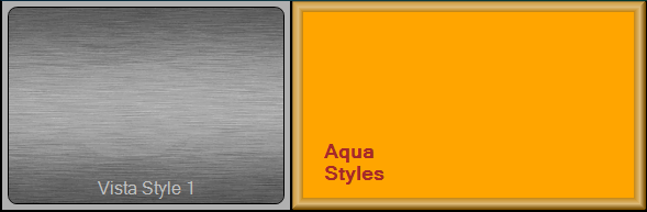
We have already seen how to create a background, let’s look at a few more. The background on the left is a JPEG image. You can use images in any format supported by GDI+, and they can also be partially transparent. The right hand side is a SolidFill, you can also use two or three color gradients that are horizontal, vertical, or diagonal.
Borders
A Stack has three borders that will always be on top regardless of where you declare them. They can have any width, but by default, they have zero width, so they aren’t used unless specified. The borders can be a RECTANGLE, ELLIPSE, ROUNDRECT, or TRANSITION.
The left side of the image above is an example of a transition border. The outer edge is rectangular and the inner edge is a round rect. The predefined borders are just for convenience, they are easy to declare because their relative positions are fixed, so you only have to declare the width.
You can also create borders without using the predefined ones, because a layer can also be any of the shapes above. The border on the right hand side in the above image was created with layers, by declaring a clipping region in the center and using gradient fills for the edges.
Style Controls
The initial version of the Style Toolkit supports button, edit and progress controls. More will be added as time permits.
StyleProgress
The StyleProgress control contains at least two stacks: a bottom stack that doesn’t change, and a top stack that changes when the control steps. The bottom stack can be just a clear layer, but it needs to exist for continuity reasons.
The StyleProgress can be a progress type, or an indicator type. The difference is that an indicator type represents how much of something (like a thermometer), it is not expected to step to the end like a progress control. The control doesn’t actually know which type it is, it all depends on how the stacks are defined.
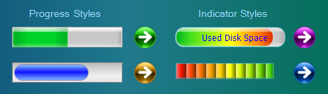
The default style is the Vista looking one in the upper left. If you don’t add any stacks to the control, it will create that style. The definitions for the default style came from Xasthom’s VistaProgressBar[^] article. You can change the colors of the default control by calling SetBackColor and SetForeColor.
The second progress bar just uses a gradient layer for the bottom and an elliptical gradient layer for the top. The motivation for this style came from Kochise’s CSkinProgress[^] article. His control actually uses a PNG image and has a few hundred more features than mine.
The top indicator bar doesn’t step the colored layer. It can’t because it would always be green to red, regardless of the position. It actually steps a clear layer on top of the colored layer which defines the clipping region.
The bottom indicator was motivated by Hans Dietrich’s XGradientZoneBar[^] article, but I added an additional wrapping gradient to give it the hump effect.
The arrows are StyleButtons that can be used to step the bars.
StyleButton
The StyleButton is an extended version of my GdipButton[^]. It has all the features of the GdipButton (like pressed state, hot state etc.), but it also has the ability to use Style objects instead of images. The StyleButton can use different styles for each of its states. They are loaded with functions like LoadStdStyle(style1) and LoadHotStyle(style2). Typically, you only need a single stack to create one of the states, but the functions take style arguments so they can call the paint function.
At a minimum, you must call LoadStdStyle() or LoadStdImage(). States that are not set by a load function will be automatically derived from the standard state.
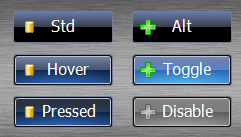
The VistaStyle1 Pane shows most of the different states the button can have. The definitions for this button were roughly derived from Jose Manuel Menéndez Poó’s article WindowsVistaRenderer[^]. Only the top two buttons (a normal button and a check type button) are fully implemented, the other four are forced to an alternate state for illustration purposes.
Implementing Styles for a Button
I chose this button style for the demo program because of its complexity. The way to create these buttons is to separate them into their unique components, or stacks in the toolkit terminology. For example, most of the states share the same base, or share the same glow, etc. When creating the style states, we just assemble the correct pieces together. The Stack class overloads the operators “=”, “+”, and “+=”, these will be described in more detail in the API section.
After defining the different operations needed to create each stack (not shown here), we just assemble the different pieces needed for each of the button states.
VBStd = VB1Base;
VBHot = VB1Base2 + VB1Hover + VB1Glow;
VBPress = VB1Base2 + VB1Pressed + VB1Glow;
VBAlt = VB1Base2 + VB1Checked + VB1Hover + VB1CheckedGlow;
VB1Base and VB1Base2 are different because the borders are different. Also note that in this implementation, the glow does not bleed over the borders. It makes more sense to me that if something is glowing behind a piece of glass, it can’t also be in front of it. The bleed over style could be implemented by just defining it differently.
After creating the different stacks, we just add them to a style and then load them into the StyleButton.
More Button Styles
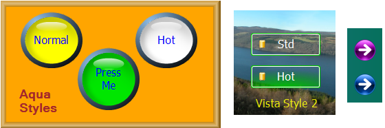
Buttons can be rectangular, elliptical, or rounded as shown here.
The definitions for the aqua style buttons were derived from the The Aqualizer Strikes Back[^] article.
The definitions for the Vista Style 2 buttons were derived from Xasthom’s Vista Style Button in C#[^] article.
The arrow buttons don’t use styles; they use a PNG file for the standard image and allow the StyleButton class to generate the other states.
StyleEdit
The StyleEdit class is derived from CEdit, and has the capability of adding a style to it. It also centers the text vertically, in addition to whatever horizontal centering may already be set. The demo program shows a few gradients with borders, I kept it simple so the text is readable. This class needs a few more tweaks and features, but I ran out of time, and it is good enough for the initial release.
Style Toolkit API
The Style Toolkit API is defined in the Style.h file.
All the API functions will take GDI or GDI+ type arguments. For example, you could pass COLORREF, CRect, and CPoint to a particular function, but you could also pass Color, Rect, and Point to the same function. The reason is because the actual API arguments are Clr, SRect, and SPoint, which are conversion classes. Internally, everything is stored in GDI+ format.
Overloaded Operators
The Stack class overloads operators “=”, “+”, and “+=”.
stack1 = stack2;
The = operator is the copy constructor, and behaves as you would expect. The layers in a stack are STL vectors, and the copy constructor will copy all the vectors in addition to doing a few housekeeping tasks. Images, strings, and regions are separate vectors, which are also copied.
stack1 += stack2;
The += operator in this example adds everything from stack2 to stack1, except the frame. Since the frame contains the borders and clipping region, stack2’s borders will be ignored and all its layers will be clipped by stack1’s bounding rectangle and shape.
stack1 = stack2 + stack3;
In this example, stack1 will contain the frame from stack2 and the layers from both stacks. The stack2 object will not be modified.
Templates
Templates are technically not part of the Style Toolkit, since you don’t need them to create styles. A template is just a mechanism that may be used to define, maintain, and share a style.
A template in the Style Toolkit is not the same as a C++ template. A C++ template is used to apply a set of behaviors to many different things; a Style Toolkit template is more analogous to a wood working template, which is used to make many copies of the same thing. For example, if a program has ten buttons, a mechanism is needed to make multiple copies of the same style, without having to define it ten times.
Since a style is just a data set, there are multiple ways you could go about creating a template. A style could be stored to an ASCII file or an XML file; however, I chose to use classes since it is a fairly simple method.
In the class method, you just define a class, add some stacks or styles as member variables, and define all the layers in the constructor. See the Templates.h and Templates.cpp files for examples.
Scope
You may notice when looking though the code that stacks are never declared with the new operator. The reason is because stacks are intended to be temporary construction objects. What makes a stack’s data permanent is when it is added to a style. The AddStack function will copy all the data to the style object, and the construction stack will be destroyed when it goes out of scope. Style objects are usually declared as member functions of a class, which gives them their permanence.
Even when a stack is declared as a member variable of a template class, the template classes themselves are temporary construction objects that are destroyed when they go out of scope.
Transparency
The bottom pane of the demo program demonstrates the use of transparency. All the components of a style can be anything from fully opaque to fully transparent. You can define the transparency of a color by using the Color class or the Clr class. If you do not declare the transparency, it will be fully opaque. For example, to define a semi-transparent blue, you would use Clr semiblue(128,RGB(0,0,255)).
Graphics Efficiency
Stacks are actually only “painted” once — the first time that they are used. Once a stack has painted all of its layers, it creates a bitmap bounded by its frame. Any subsequent paint call to the stack just copies the bitmap to the device context. The exception to this is when the stack’s Regenerate function is used. The Regenerate function marks the stack as “dirty”, and it will be repainted the next time it is needed.
When the PaintStyle function is called, it copies all the “clean” stack bitmaps to the device context. The reason it copies them individually is because the style doesn’t know if any of the stacks are “dirty” until it iterates through them.
There is no practical limit to the number of layers and stacks you can have. Also, using the Style Toolkit is not slower than using GDI+ directly. The reason for this is because stacks and layers are really just nested loop counters of the Style object that define a sequence of graphics operations. Defining the operations in an array versus calling them with subsequent lines of code doesn’t change the number of graphics operations needed. The Style Toolkit does all its painting in memory, then copies the end result to the screen.
How to Efficiently Use the Style Toolkit
In order to minimize paint operations, create different stacks for things that are dynamic versus static. For example, the progress control’s background never changes, so it has its own stack that only gets painted once. The foreground needs to be regenerated every time a step occurs, so it is in a separate stack.
Any stack on top of a stack that has been marked for regeneration also needs to be marked for regeneration by the user. Even though an upper stack itself may not have changed, its background did, and therefore its bitmap is incorrect. The toolkit doesn’t do this automatically since it doesn’t keep track of, or care about, the relative positions of stacks.
Needless to say, if a layer is completely covered by another layer or stack which is not at least partially transparent, then it should be removed. The stack code does not attempt to identify and/or remove any redundant paint operations.
Issues and Workarounds
GDI+ has a few issues that will create unexpected results.
- Asymmetry – GDI+ has symmetry problems when it comes to creating rounded rectangles. See my RoundRect[^] for details. I have implemented workarounds for some if not all of these issues in the
Border class. The Border class is an extended version of the RoundRect class.
- Artifacts – GDI+ will sometimes create artifacts (extra lines that shouldn’t be there) when using a
GradientBrush. If this occurs, try one of the following:
- Change the size of the object with the artifact. This is the easiest method and it usually works, but it may not be an acceptable solution.
- Try different Smoothing and Interpolation modes. This sometimes works, but it also has a tendency to move the problem around.
- If the artifact occurs when using the
AddEdgeEffect function, try using the profile version, and adjust the profile parameters until the artifact disappears.
- Delayed Painting – The controls won’t be painted until they get the Windows message telling them to do so, which introduces some delay. If there are many controls like in the demo program, they will tend to pop in, after the background has been painted. This is a rather undesirable effect, and can be circumvented by pre-painting the control onto the background. The control still paints itself later, but you can’t tell because it is painting the same thing. See the Vista Style 2 or Aqua Style buttons for examples on how to do this.
Final Comments
The demo programs were compiled with VC6 and VS2005, and tested on Windows XP. However, the Style Toolkit should work with any compiler and platform that supports GDI+.
More controls and features will be added as time permits. If you would like a specific control added, request it in the message section.
posted on 2008-08-15 21:40
cpsprogramer 閱讀(1720)
評論(1) 編輯 收藏 引用 所屬分類:
VC++