MUILIB支持多種模式的按鈕:
1、支持純顏色狀態
2、支持帶狀態的圖標
3、支持按鈕文字的狀態顏色
4、支持多模式按鈕狀態圖片
5、支持按鈕圖標和文字混合顯示
6、支持按鈕規定寬度和自適應寬度

 XML配置代碼
<?xml version="1.0" encoding="UTF-8"?>
<muiapp>
<Resources>
<Images>
<Image name="btn" file="images\btn.bmp" painttype="xycenter">
<Image name="nor" source="0,0,22,22" />
<Image name="hot" painttype="stretch9" margin="2,2,2,2" source="22,0,44,22" />
<Image name="pus" painttype="stretch9" margin="2,2,2,2" source="44,0,66,22" />
</Image>
<Image name="btn_clr" file="images\btn_clr.bmp">
<Image name="nor" source="0,0,75,26" />
<Image name="hot" source="75,0,150,26" />
<Image name="pus" source="150,0,225,26" />
</Image>
<Image name="btn_all" file="images\btn_all.bmp" mask="#FFFF00FF" painttype="xycenter">
<Image name="nor" mask="#FFFF00FF" painttype="stretch9" margin="2,2,2,2" source="0,0,69,21" />
<Image name="hot" mask="#FFFF00FF" painttype="stretch9" margin="2,2,2,2" source="0,21,69,42" />
<Image name="pus" mask="#FFFF00FF" painttype="stretch9" margin="2,2,2,2" source="0,42,69,63" />
<Image name="foc" mask="#FFFF00FF" painttype="stretch9" margin="6,6,6,6" source="0,63,69,84" />
<Image name="dis" mask="#FFFF00FF" painttype="stretch9" margin="3,3,3,3" source="0,84,69,105" />
</Image>
<Image name="back" file="images\back.png" painttype="stretch9" marginalpha="126" outsidemargin="10,10,10,10" margin="6,6,6,6" />
<Image name="icon" file="images\icon_color.png" painttype="xycenter" />
</Images>
<Colors>
<Palette id="1" name="11">
<Color id="2" name="nor" value="#FFC0C0C0" />
<Color id="2" name="hot" value="#FFE0E0E0" />
<Color id="2" name="pus" value="#FF808080" />
<Color id="2" name="pus_1" value="#FFA0A0A0" />
<Color id="2" name="foc" value="#FFE5E8E0" />
</Palette>
</Colors>
</Resources>
<Window size="400,260" caption="0,0,0,-1" showdirty="false" backalpha="250" bkcolor="#00000000" bkimage="@back">
<VertiPanel margin="20,20,20,20" childpadding="5">
<VertiPanel bordersize="1,1,1,1">
<HorizPanel bordersize="1,1,1,1" height="26">
<Label textpadding="5,0,0,0" text="純顏色按鈕 - 按鈕狀態使用顏色表示,同時演示了按鈕寬度" mouse="false" />
</HorizPanel>
<HorizPanel margin="5,5,5,5" childpadding="5">
<Button normalcolor="#FFC0C0C0" hotcolor="#FFE0E0E0" pushedcolor="#FFA0A0A0" focusedcolor="#FFE5E8E0" textpadding="5,0,5,0" text="按鈕一" bordersize="1,1,1,1" tooltiptext="自適應按鈕文本寬度" />
<Button normalcolor="#FFC0C0C0" hotcolor="#FFE0E0E0" pushedcolor="#FFA0A0A0" focusedcolor="#FFE5E8E0" textpadding="5,0,5,0" text="按鈕2" bordersize="1,1,1,1" tooltiptext="自適應按鈕文本寬度" />
<Button normalcolor="#FFC0C0C0" hotcolor="#FFE0E0E0" pushedcolor="#FFA0A0A0" focusedcolor="#FFE5E8E0" hottextcolor="#FF0000FF" pushedtextcolor="#FF00FF00" text="固定寬度" bordersize="1,1,1,1" width="100" tooltiptext="按鈕寬度為設定的寬度" />
<Button disabledcolor="#FF808080" enabled="false" text="全寬度按鈕-不可用" bordersize="1,1,1,1" estimatewidth="false" tooltiptext="按鈕寬度為父容器剩余寬度" />
</HorizPanel>
</VertiPanel>
<VertiPanel bordersize="1,1,1,1">
<HorizPanel bordersize="1,1,1,1" height="26">
<Label text="圖片按鈕 - 按鈕狀態使用圖片進行表示" mouse="false" />
</HorizPanel>
<HorizPanel margin="5,5,5,5" childpadding="5">
<Button normalimage="@btn_clr:nor" hotimage="@btn_clr:hot" pushedimage="@btn_clr:pus" text="按鈕一" width="100" />
<Button normalimage="@btn_all:nor" hotimage="@btn_all:hot" pushedimage="@btn_all:pus" focusedimage="@btn_all:foc" disabledimage="@btn_all:dis" normalicon="@icon" textmodel="right" text="按鈕二" width="120" />
<Button normalimage="@btn_all:nor" hotimage="@btn_all:hot" pushedimage="@btn_all:pus" focusedimage="@btn_all:foc" disabledimage="@btn_all:dis" enabled="false" text="按鈕三-不可用" width="120" />
</HorizPanel>
</VertiPanel>
<VertiPanel bordersize="1,1,1,1">
<HorizPanel bordersize="1,1,1,1" height="26">
<Label text="圖標按鈕 - 按鈕帶有圖標,按鈕狀態使用圖片進行表示" mouse="false" />
</HorizPanel>
<HorizPanel margin="5,5,5,5" childpadding="5">
<Button normalimage="@btn:nor" hotimage="@btn:hot" pushedimage="@btn:pus" normalicon="@icon" iconwidth="20" iconheight="20" width="60" />
<Button normalimage="@btn:nor" hotimage="@btn:hot" pushedimage="@btn:pus" normalicon="@icon" iconwidth="26" iconheight="20" iconpadding="4,2,2,2" showtext="true" textmodel="right" align="left" text="按鈕二" width="80" />
<Button hotimage="@btn:hot" pushedimage="@btn:pus" hottextcolor="#FFFFBBBD" pushedtextcolor="#FF96FF99" enabled="true" text="按鈕三" estimatewidth="false" />
</HorizPanel>
</VertiPanel>
</VertiPanel>
</Window>
</muiapp> 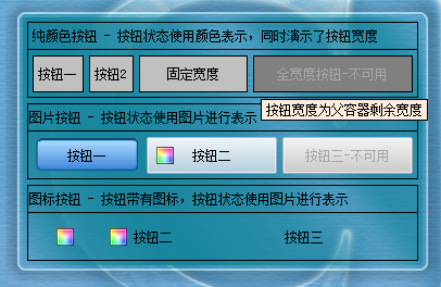 點擊下載上圖所示的演示資源
下載資源后解壓縮至目錄,請使用MUIPlayer打開其中的mui文件
muiplayer可以在
www.muilib.com下載